Field notes
Louis Vuitton details that only a close frame settles
Three observations about Louis Vuitton materials, written from the frames these albums actually publish. They apply to the listing you are reading now, whichever seller is behind it.
01
Canvas alignment is a geometry test you can run in a browser
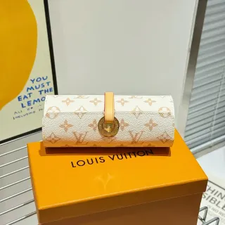
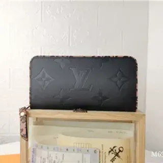
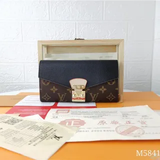
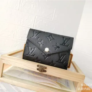
Monogram rows should cross a seam at the same height on both sides, and the symbol spacing should stay constant across the body, the flap and the pocket. Ask for one frame straight on, camera level with the centre of the bag, plus one of the seam line itself. A camera held high or off-axis bends every row, which is exactly how an album hides a misaligned panel.
02
Plating reads as tone in one frame and weight in none
Hardware tone is photographable: brass should read warm and even across the buckle, the rivets and the zipper pull, without one piece reading yellower than the rest. Plating thickness, engraving crispness on the underside and how the finish wears at the corners are not. Ask for the hardware in daylight rather than studio light, and for the zipper pull from the side, where the stamping depth is easiest to see.
03
The lining question is a stitching question
Inside the bag is where a listing usually goes quiet. Ask for the interior label in focus, the seam allowance behind it, and the lining surface at an angle so its sheen can be judged. A canvas lining and a textile lining reflect differently, and a stamped date code has soft edges while a printed one sits on the surface. Those three frames are the cheapest part of the inspection and the one most albums skip.